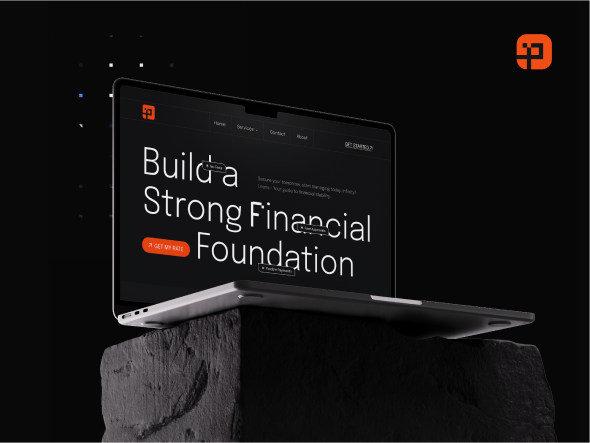
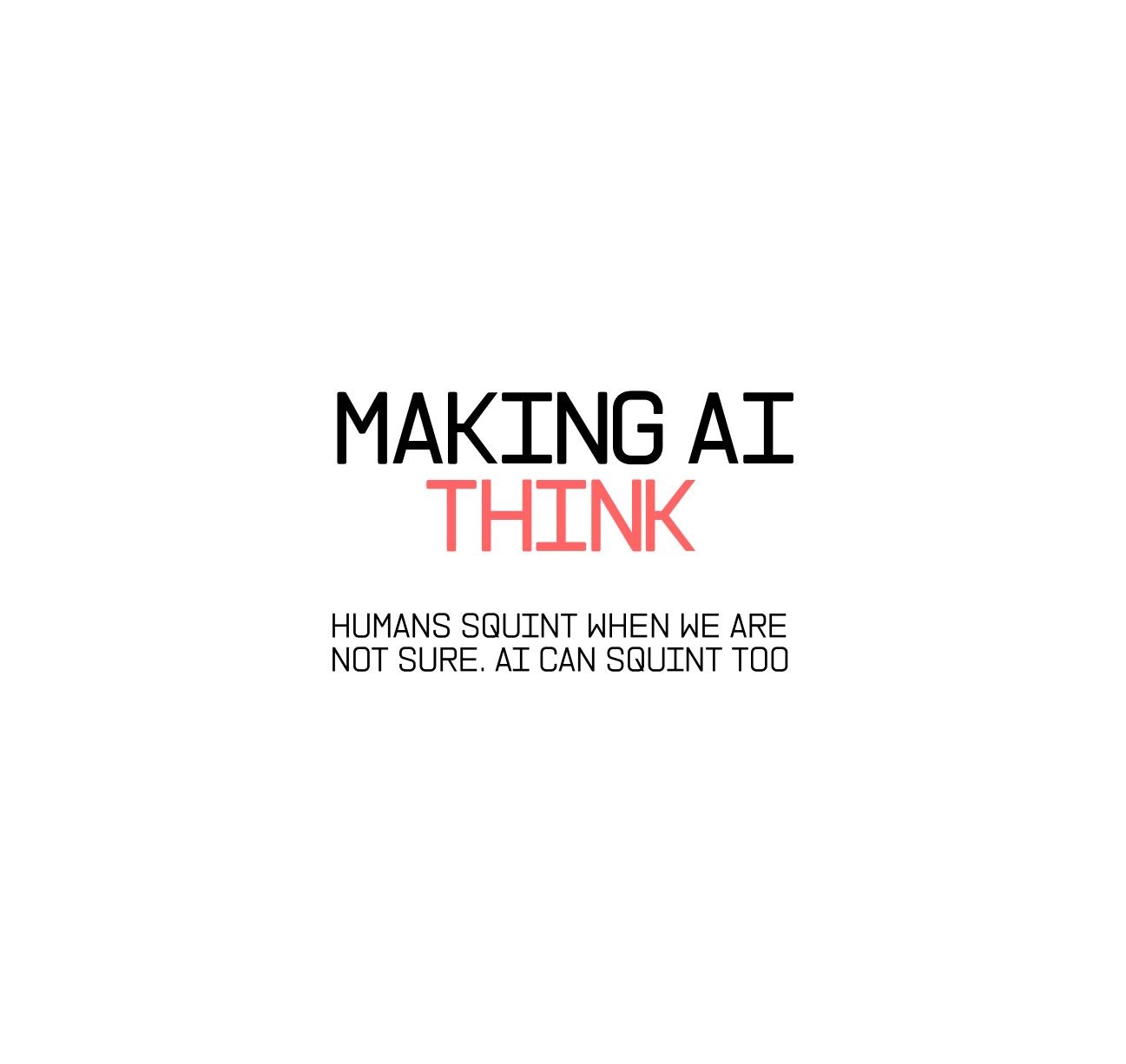
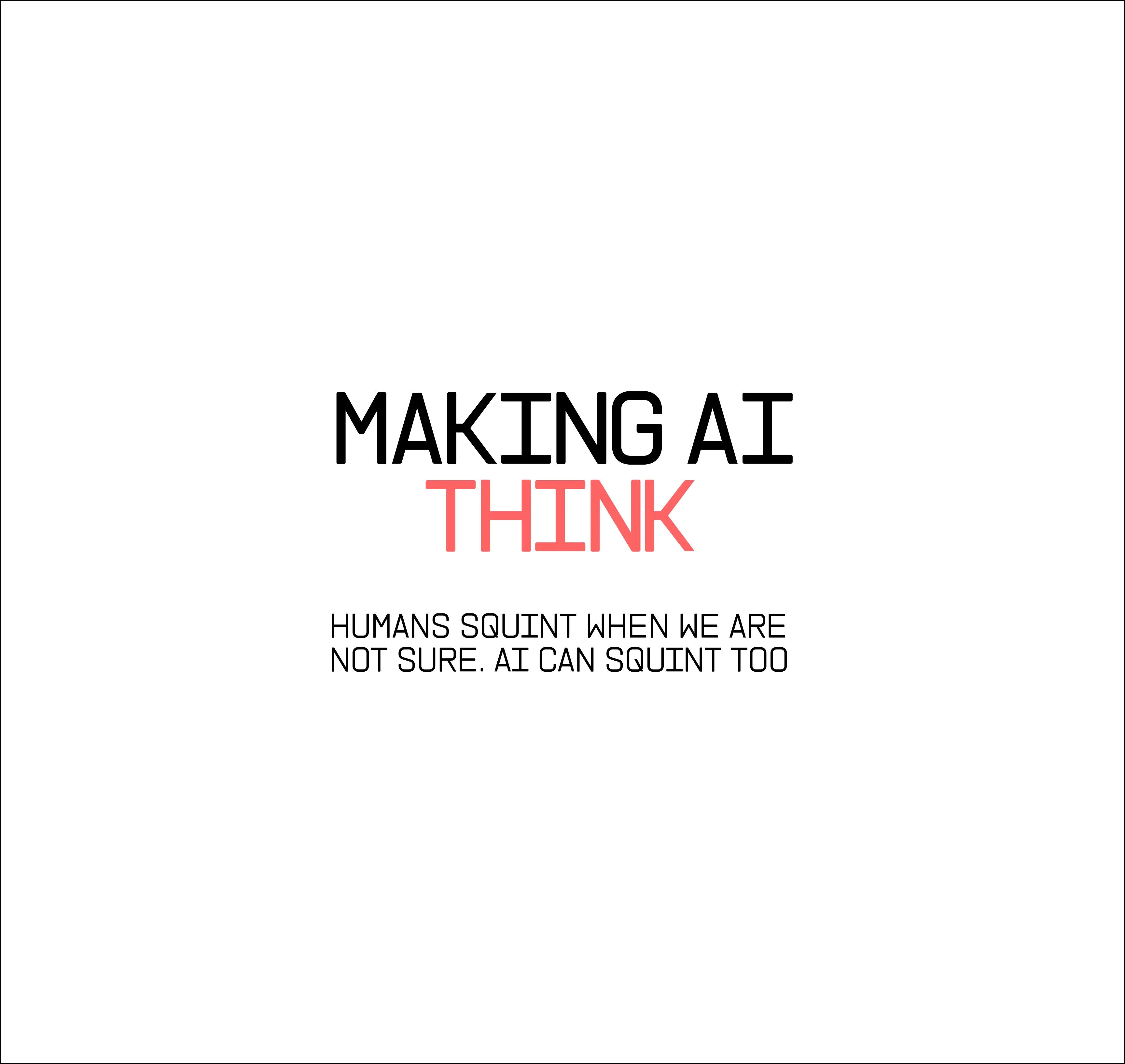
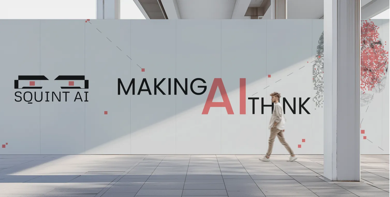
A bold AI tool designed to challenge, moderate, and refine machine thinking.
Branding
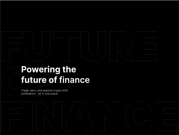
Ui/Ux Design
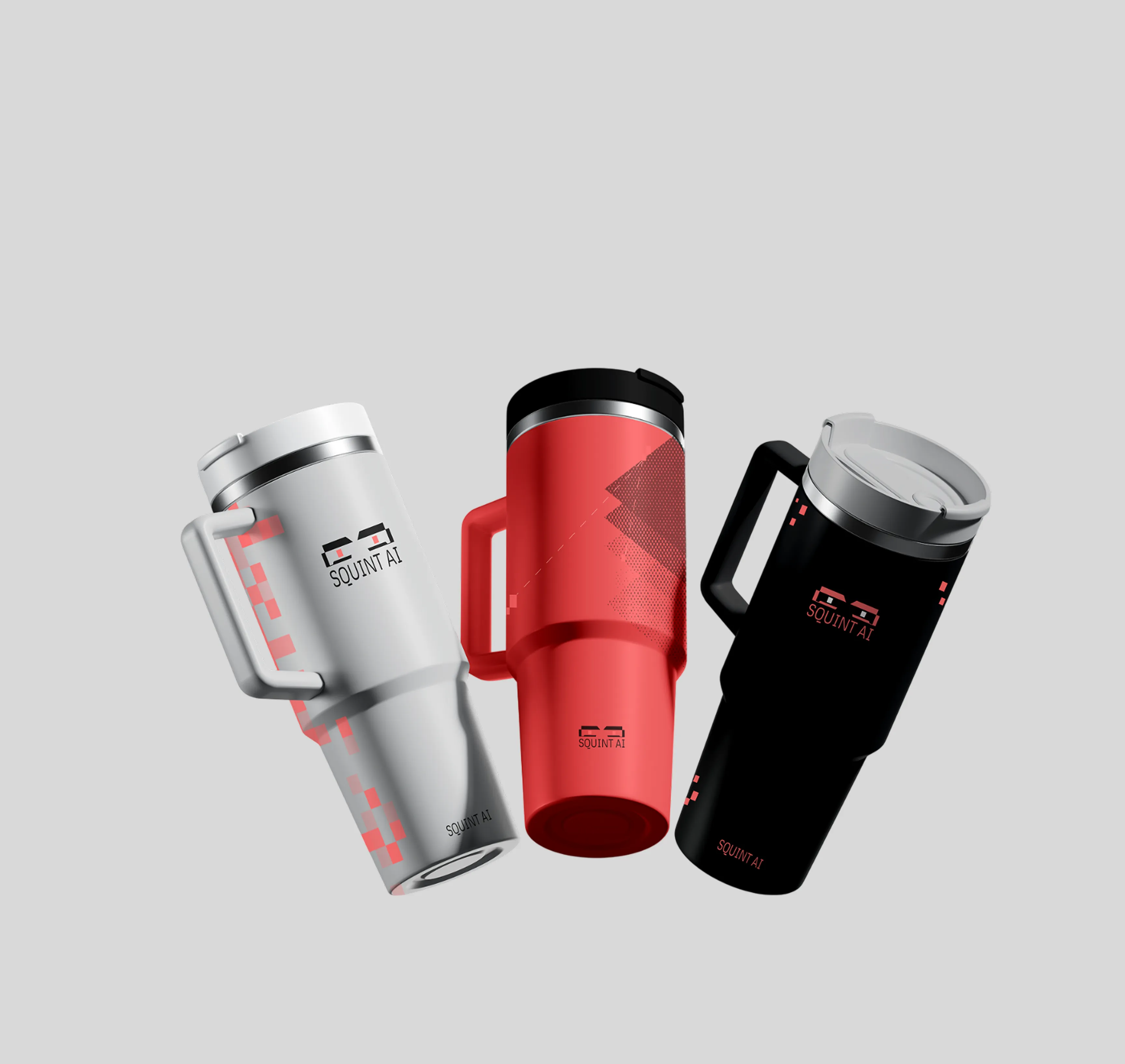
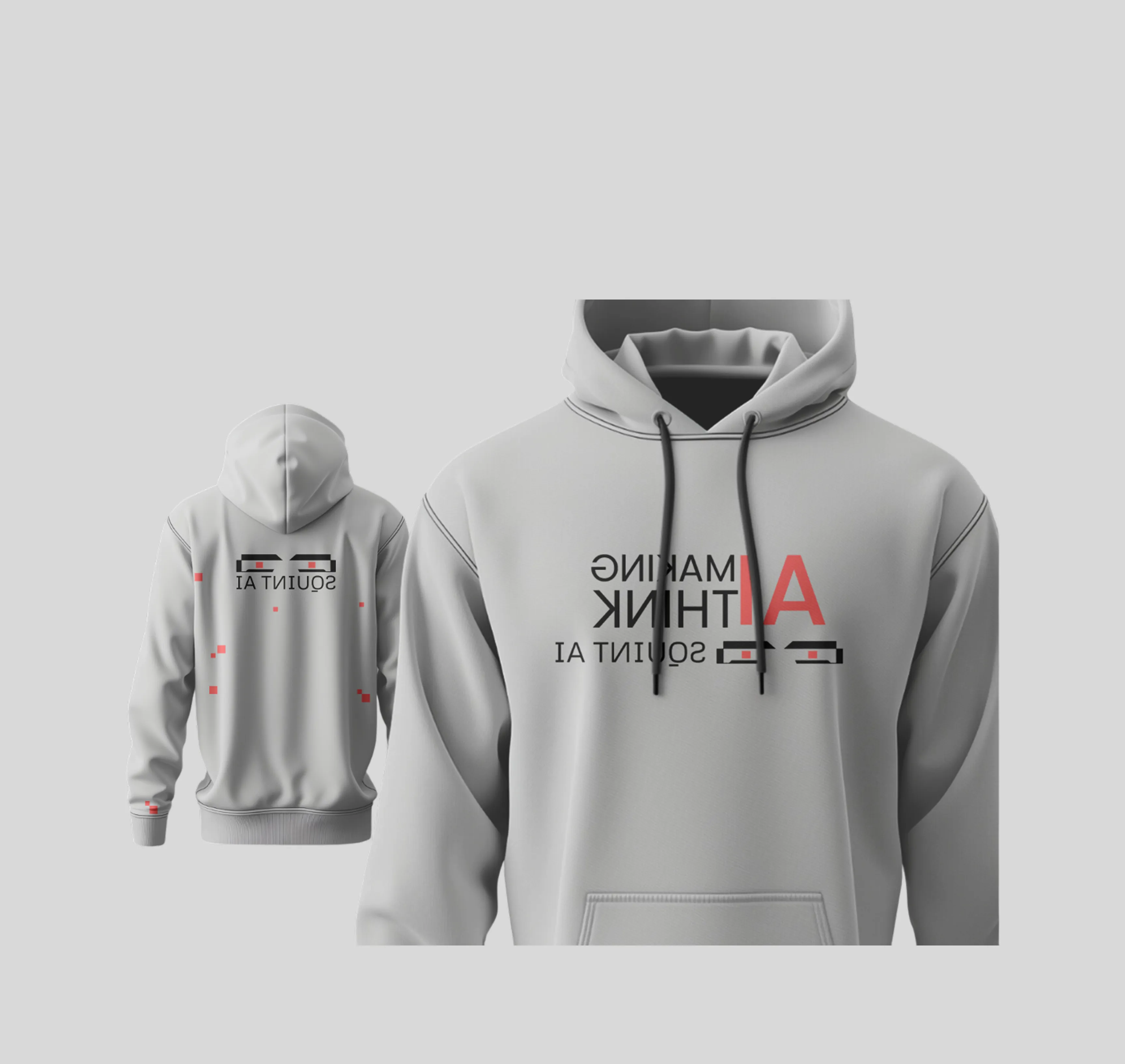
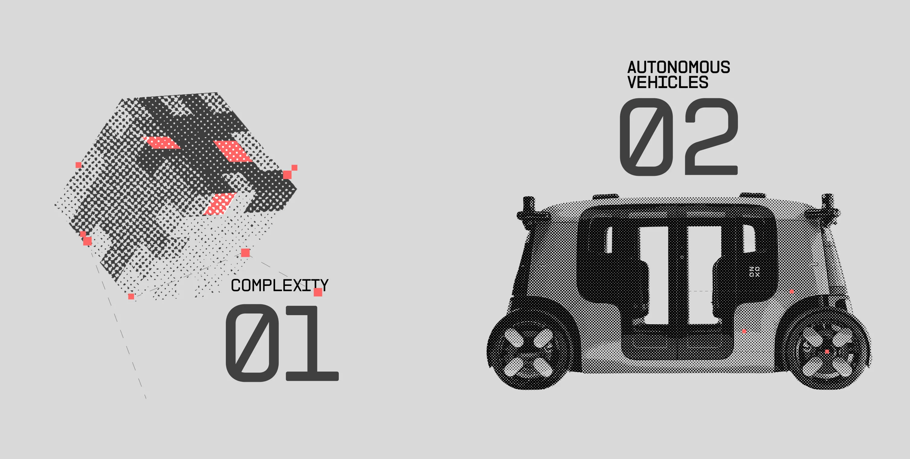
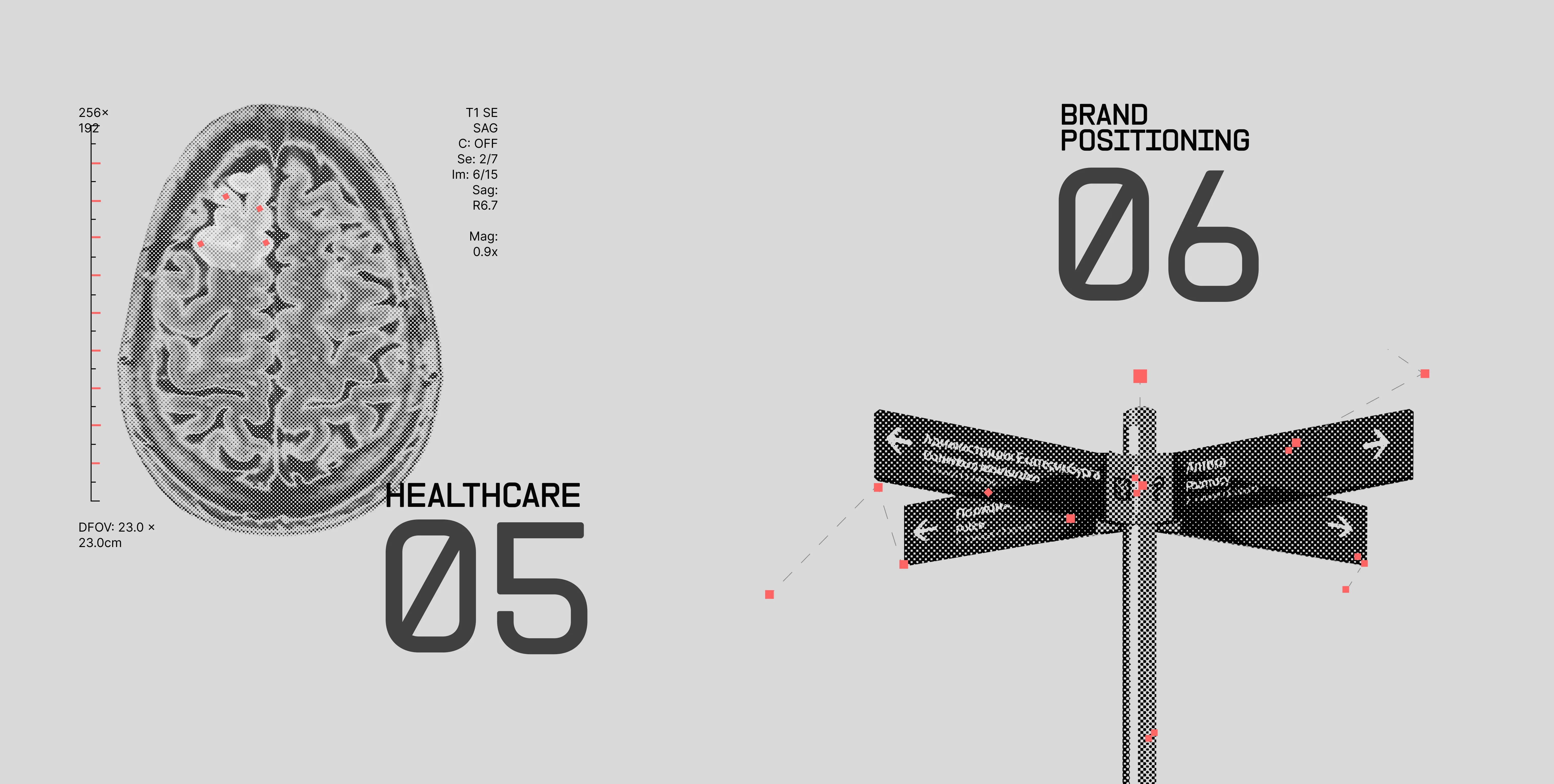
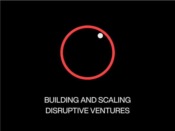
Squint’s identity is built to reflect its AI-first mindset - sharp, intelligent, and disruptive. We used the pixel as a metaphor for digital thinking, forming the foundation of the entire design system.
Halftone imagery, stark black-and-white contrast, and bold red accents bring the brand to life. Each square signals precision, control, and the raw mechanics of machine cognition.
BRAND COLORS
FFFFFF
255, 255, 255
WHITE
868484
134, 132, 132
SMOKE
000000
0, 0, 0
BLACK
FF6565
255, 101, 101
ORANGE-RED
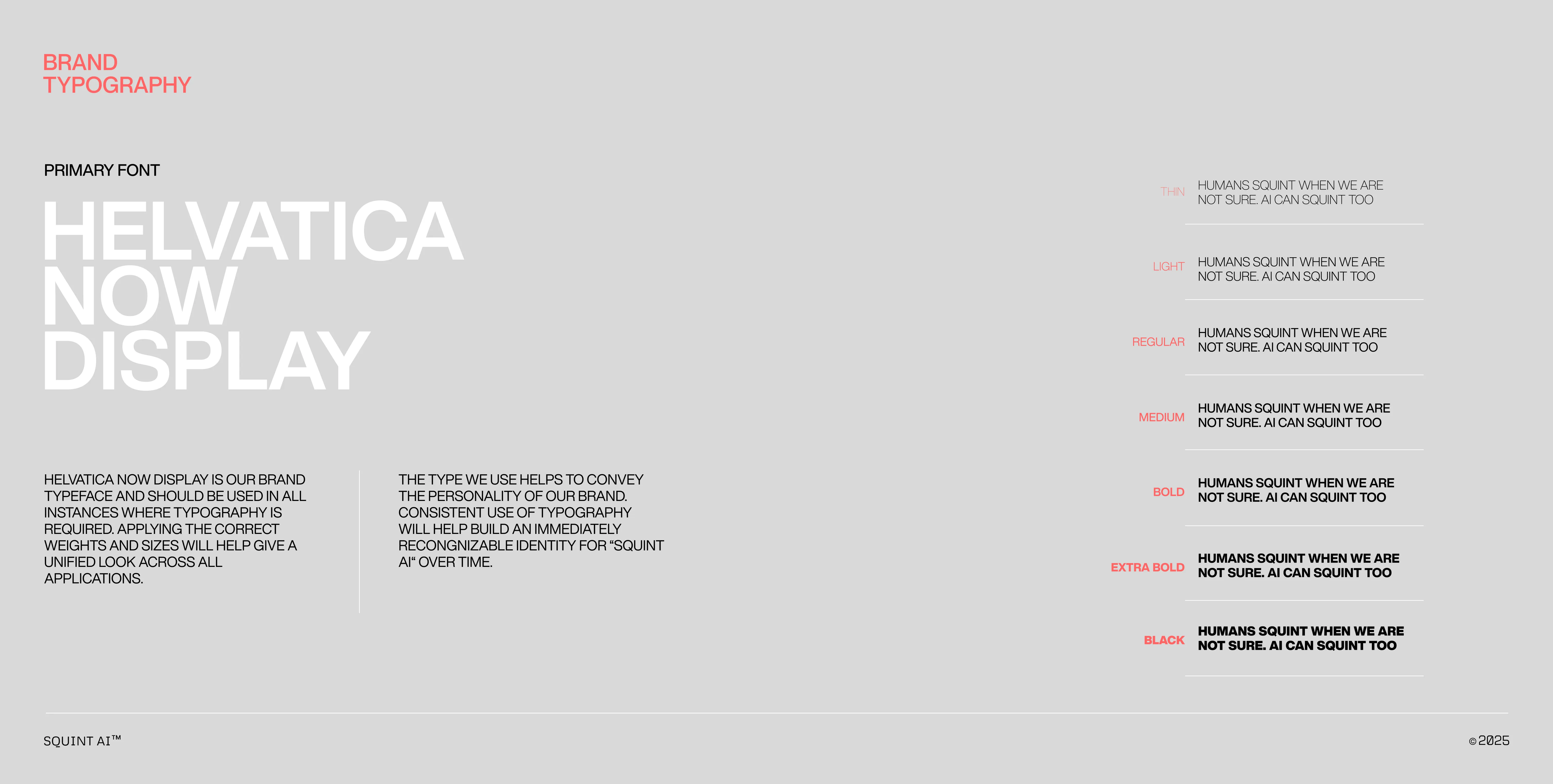
BRAND TYPOGRAPHY
Secondary FONT
MONTECH V.02
MOntech v.02 IS OUR BRAND TYPEFACE AND SHOULD BE USED IN ALL INSTANCES WHERE TYPOGRAPHY IS REQUIRED. APPLYING THE CORRECT WEIGHTS AND SIZES WILL HELP GIVE A UNIFIED LOOK ACROSS ALL APPLICATIONS.
MOntech v.02 IS OUR BRAND TYPEFACE AND SHOULD BE USED IN ALL INSTANCES WHERE TYPOGRAPHY IS REQUIRED. APPLYING THE CORRECT WEIGHTS AND SIZES WILL HELP GIVE A UNIFIED LOOK ACROSS ALL APPLICATIONS.
.gif)


.webp)


.webp)